Shape Widget
Connected Data Compatible
This handy widget packs a lot of punch, allowing you to create unique buttons, banners, tags, awards, or even apply interesting shapes to images on your site. Upon opening the widget, you’ll find 20 different shapes to choose from. You can control shape size, text, shadow, add a background color or image.

Here are a few examples of widget usage ideas:
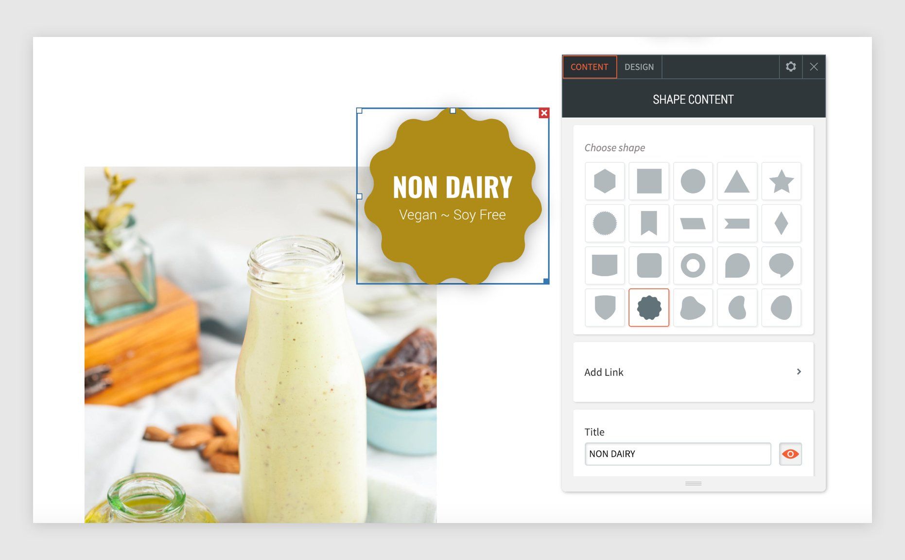
Highlight
By adding title and subtitle text to the round wavy shape, you can easily bring attention to a product or feature. The shape can be placed on top, or partially on top of images or other elements by applying a negative value to spacing settings.
Flag
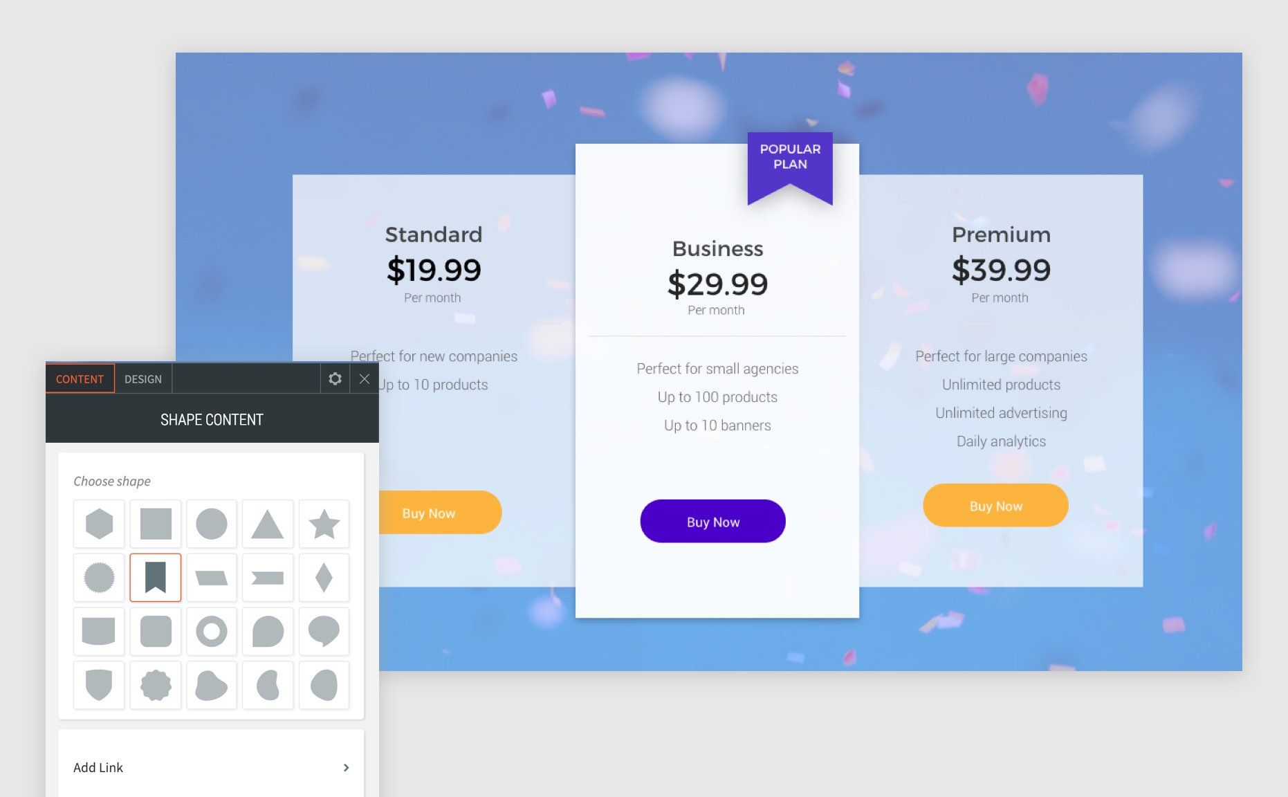
The flag shape can be used to notate a specific option or list item. Add text and background color as needed.
Tip: Toggle off “Keep proportion” so you can adjust only the width.
Anamorphic Images
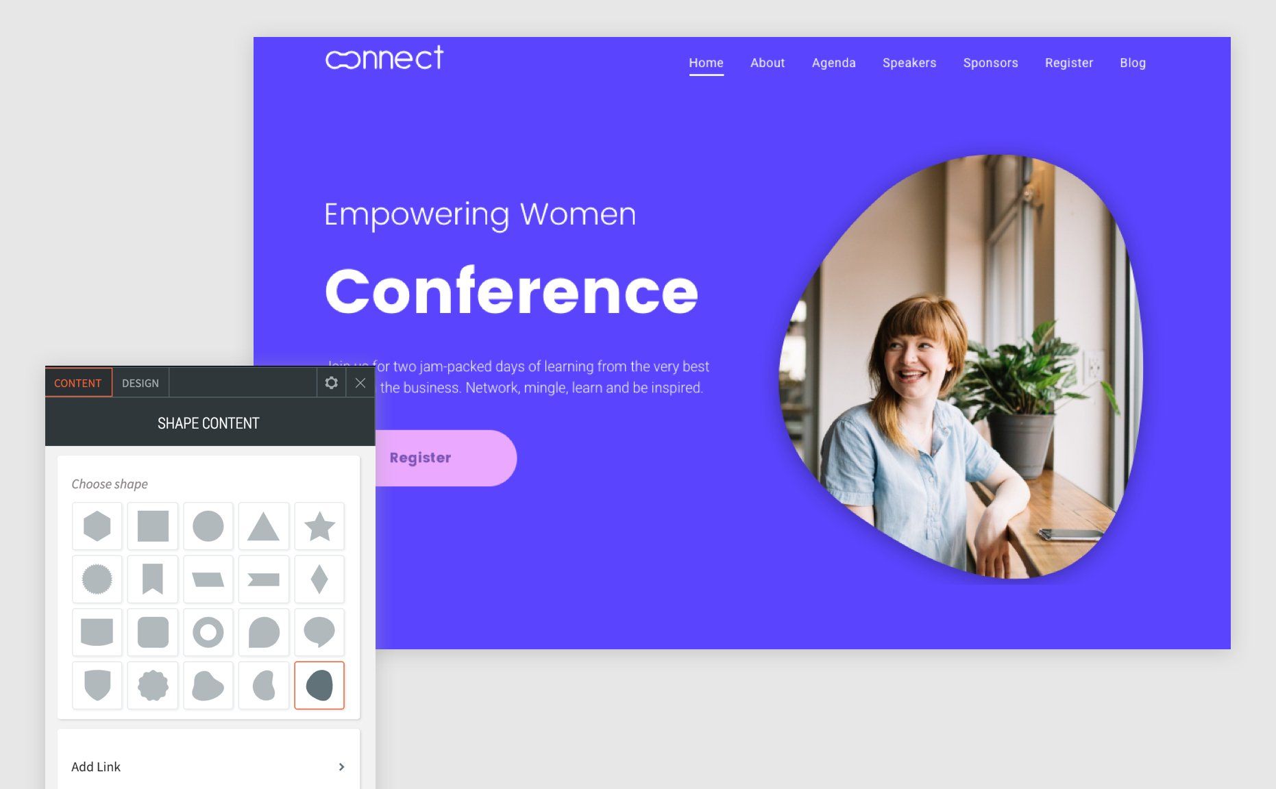
Non-uniform image shapes are a fresh alternative to rectangular images. When using in a column next to text copy, make the shape as large as the text column. Finally, set an image for the shape using the Design tab.
Scroll Button
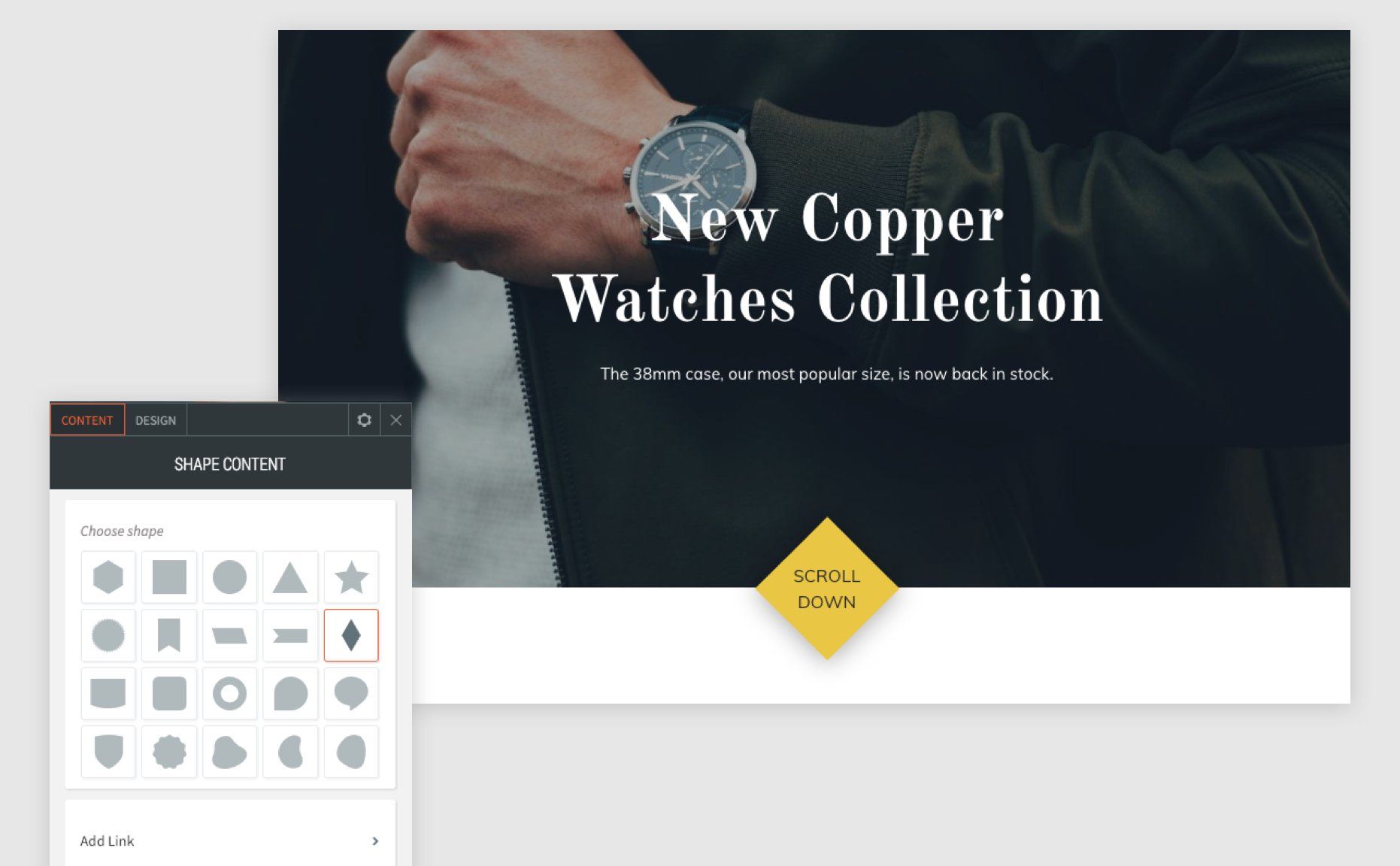
Looking for a way to create a unique scroll prompt or back to top button? Try using the diamond shape. Increase the width to set equal width/height, and set a negative spacing value to place partially on top of an image or row.


